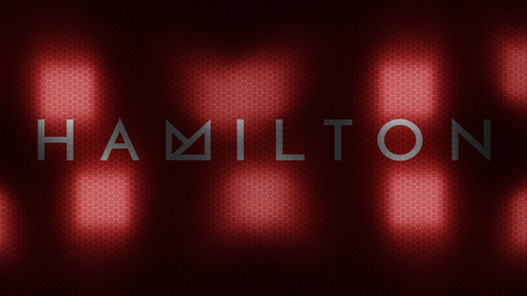
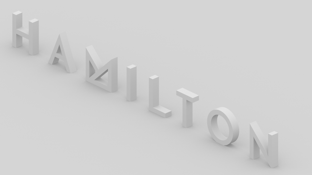
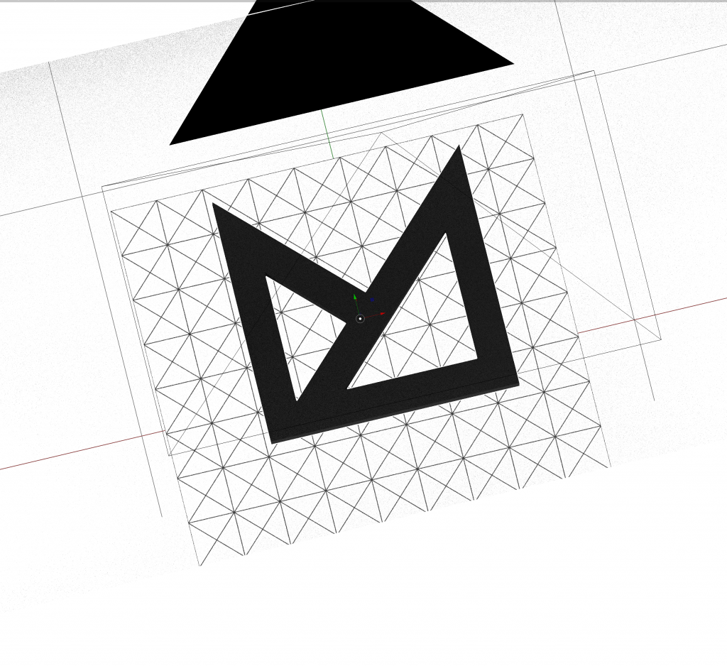
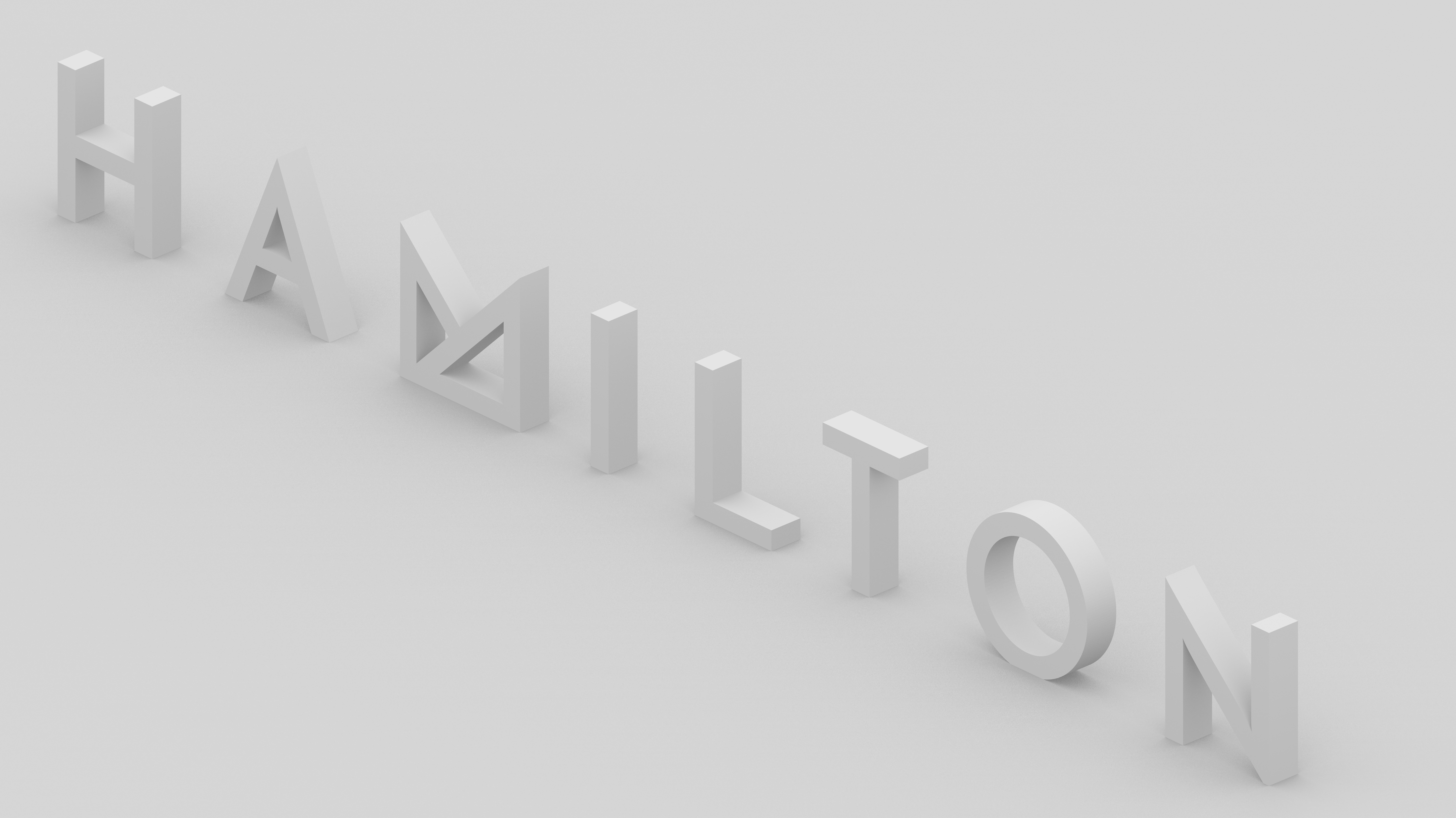
This post originally appeared on the first version of my blog in 2017. I still use it in certain spots even though my new triangle version (M▵RK) is what I use on my blog.
We talked about something geometric, but still very minimal; if it was on the side of a car you’d think that it was going to another planet. This logo would also feature a triangle as part of the theme that I wanted to curate here.
I hired Leanne Bridie of andmethod.com to draft something.
When you’re looking for a designer it’s so easy to just glaze over portfolios, but it’s arguably more vital to hire someone you can understand. There’s a magic that happens between a designer and their client when the client knows what they want and the designer knows how to get there. That communication is the basis for something bigger.
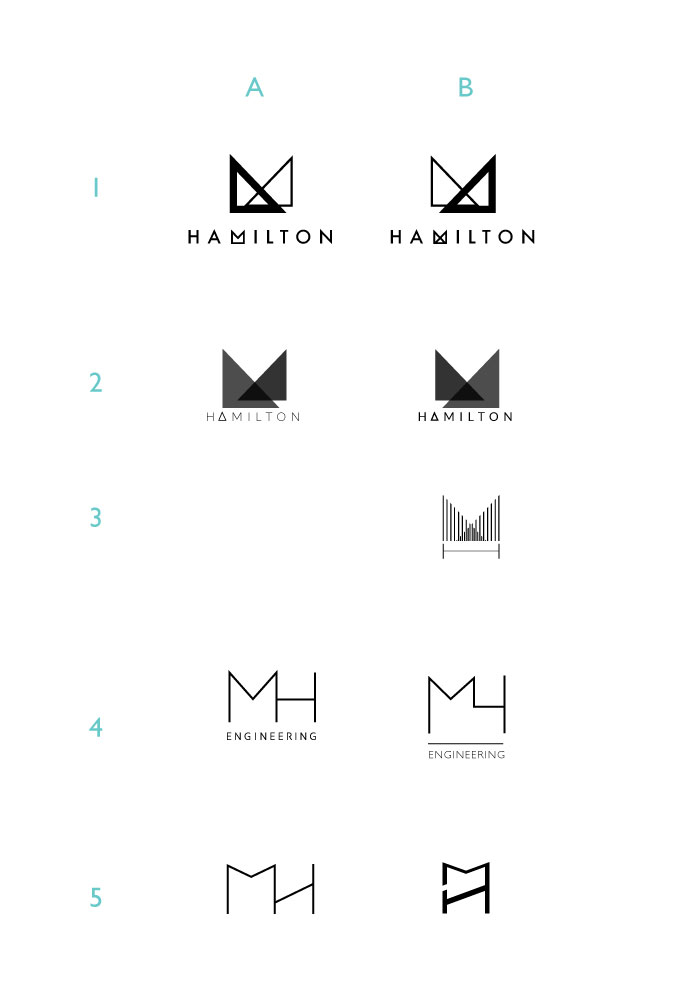
After the second round of ideas I needed about 2 weeks to passively sit with these. We iterated some of them and nothing was clicking. With some time away and fresh eyes I noticed that just the “HAMILTON” in the first row by itself is pretty elegant, and with some more slight alterations this became the wordmark for the site.
Some of the best ideas come by chance, but without the skill driving it ideas have less chance of taking hold. Awesome work Leanne & thanks again.
